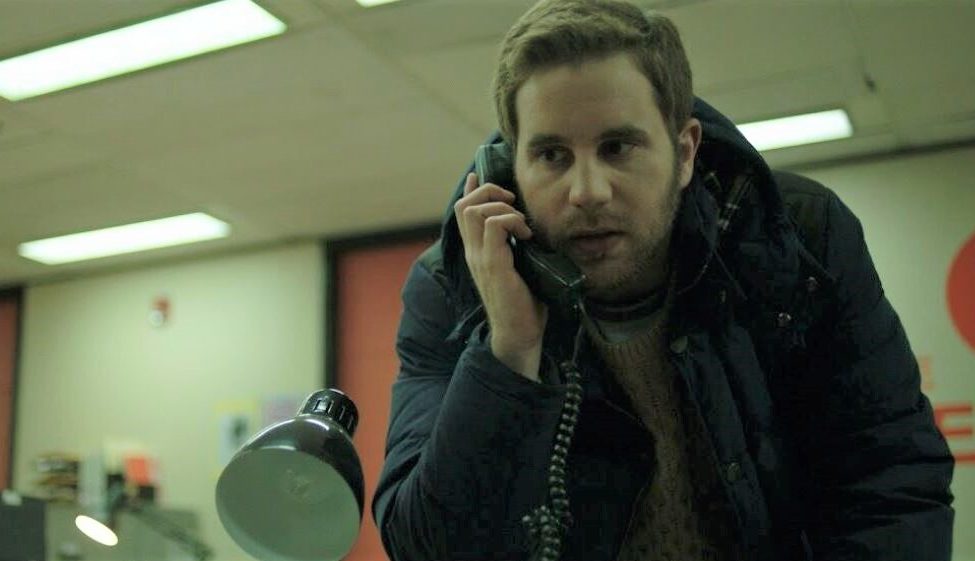
How ‘Run This Town’s’ Production Designer Brought Color to Office Settings
By Jazz Tangcay
LOS ANGELES (Variety.com) – When production designer Chris Crane took on “Run This Town,” he was presented with a unique challenge: getting color out of traditional, often beige, office environments.
Based very loosely on the 2013 story of Mayor Rob Ford caught smoking crack on video, a young journalist, Bram (Ben Platt), meets a source who has the video for sale. The story centers on a group of millennials and editors in a newsroom that is downsizing, and Bram finds himself having to go and land that clicky story.
Set mainly between City Hall and a newsroom, Crane originally didn’t see much room for creativity, as the story was seeped in realistic settings. However, director Ricky Tollman had the opposite idea.
“He totally saw it as creative,” Crane says. “We had trouble finding actual locations, so we had a lot of building to do.”
The one thing Crane wanted to do was step away from beige. “I ended up putting orange in it and that just came out of nowhere, but it became the inspiring point,” he explains.
Art director Joël Guzman came up with the graphic designs and logo option, and Tollman happened to pick the one that featured orange.
From there, Crane worked on transforming a derelict media office in Quebec into the newsroom. “We started with it as a small room, but it grew. We found new rooms to add, such as the meeting room, and we just kept finding ways to enhance it,” Crane says. He used references by looking at actual offices, but made them look a little dated.
“We had fun with a few things, contrasting things such as the computers that were up to date, but we also wanted to remind people that this paper was taken over by clickbait media,” he says.
The only problem was that the previous tenants had also used the office to play golf in, so Crane found holes in the walls. Once he had fixed that, he worked on making custom desks, adding in pillars and walls.
Crane made sure to decorate and personalize all the desks in the newsroom. If at any point the actors wanted to pick something up, they could. “I wanted to make sure if the camera caught something, it wasn’t just a scribble on a piece of paper,” he says.
He purposely didn’t add any orange to the desks. When Tollman noticed that, “he asked me to put more orange in and so I ran to the Salvation Army and peppered the desks with orange things,” he says. “For me, that was fun. I was worried we were going too far, but for Ricky, we weren’t going far enough.”
Nick Haight served as the film’s cinematographer, and Crane had previously worked with him on 2018’s “Clara.” Crane walked through the locations with Haight and Tollman, who came up with shot lists.
That collaboration process helped Crane when designing his sets. Similarly, when collaborating with the film’s costume designer, Hanna Puley, she would let him know what colors she intended to use. “That way, I made sure we didn’t overlap. For the most part, I tried to give as much information as possible,” he says.

