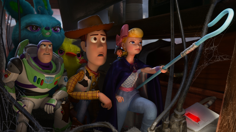
How Pixar Team Created the Environment of ‘Toy Story 4’
By Jazz Tangcay
LOS ANGELES (Variety.com) – When “Toy Story” was first released in 1995, the most important element was the story, and for each subsequent installment that followed, story was vital.
Production designer Bob Pauley who has been on the Pixar journey from the beginning explained, “Every time, the story was key. Looking back at “Toy Story” it looks a bit like a video game, but that story still holds up and that’s the main spine.”
Between the 1995 release of “Toy Story” and 2019’s “Toy Story 4,” Pauley’s software toolbox grew and expanded over the studio’s 21 films. That experience and expertise allowed the conversations in the art room to evolve from “I don’t know if you can to that,” to “That’s not so scary.”
The progression of software tools allowed for the realistic rain effect during the storm scene that opens the film, and didn’t pose the challenge it posed in the first “Toy Story.” Similarly, the team could work on details such as fabric fibers and levels of dust particles. What typically would take weeks to render, now took days. This allowed Pauley and his team to explore and dedicate more time to creating the intricacies of the “″ world.
The biggest challenge for Pauley was creating the antique mall. “It’s like taking a giant Costco and you have to put antiques in it,” he says.
The first thing Pauley did was visit numerous antique stores and look at items for inspiration. “Toy Story 4” wouldn’t be a Pixar movie without hidden Easter eggs, and the mall was the perfect spot to place them. Look closely, and you’ll spot Coco’s “Remember Me” is the record on the record player and the green diver’s mask and tiki heads are from the fish tank in “Finding Nemo.”
Filling the space was a fun challenge for Pauley and required collaborating with the director and the camera team to understand where they were going, what the sequence meant and how it was driving the sequence forward. In total, the mall was filled with over 10,000 props and became one of the most detailed sets in the history of Pixar animation.
Designing the world of the antique mall was also about looking at scale and communicating with the audience that this was a world from the point of view of a toy. Pauley says, “Everything was huge to them.”
Within that world, Pauley had the luxury of creating another world, the world inside the pinball machine.
“We had to figure out where the toys meet up,” Pauley explained. “That place was inside the pinball machine and it was so much fun to explore.”
As it turns out, art department head Daniel Holland owned a pinball machine and brought it into the offices. “We opened the door and it was mind-blowing,” Pauley says.
Holland’s vintage 1970s pinball machine was from the ‘70s provided the art team with the insight they needed, as it wasn’t filled with the electronics found in modern pinball machines.
The advances in Pixar software enabled the team to replicate the lighting so it felt natural or dramatic depending on where the toys were. Inside the pinball machine, the lights on top of the machine lit the underneath. With the low-level lighting detail, they could hone in and refine to give it a night club feel that was the ideal world for the toys to hang out in.
The benefits of being able to create a world within the store, says Pauley, are that “We got to add different toys that lived inside the machine. We got to show you places where adults don’t get to go.”

