How ‘Joker,’ ‘Queen & Slim’ and ‘Ford v. Ferrari’ Production Designers Construct Script Worlds on Big Screen
By Zoe Hewitt
LOS ANGELES (Variety.com) – Building a cinematic world doesn’t mean finding the mythical perfect location and then watching the director of photography set up a camera. Rather, the Herculean task for production designers is to further the storytelling through designing sets and reimagining locations so every detail contributes to the whole of the scripted story.
Relating the sets to the script isn’t a simple task. For “Joker” production designer Mark Friedberg that meant delving into the emotions of the story. “The concept or idea [was that] in this case the story was about a society that was not functioning,” Friedberg says. “It was about a world that was hard and mean and without empathy.”
Friedberg created a 400-page look book filled with research, inspiration, concepts, a color palette and the historical and cultural references for the sets.
“We wanted very much for the world we were creating to relate to a version of the world that people live in now,” he says. “It’s a period movie [and] it’s set in a time of dysfunction.”
Friedberg and his crew built theater façades, at least 20 storefronts, hung huge signs and painted graffiti and murals to shape Gotham Square, a spot that’s actually in Newark, N.J.
François Audouy, the production designer on “Ford v Ferrari,” also had to substitute one city for another, but with the challenge that the actual ones are still in existence. Los Angeles stood in for multiple cities and locations including Michigan, Florida, Italy and France.
Audouy leaned on a particular color palette in order to clue audiences in quickly as to where they were in the world. “The world of Ford was rectilinear with steely blues and lacquered woods,” Audouy writes in an email. “In contrast, Ferrari’s factory had textural earth tones with red accents driven by Ferrari’s distinctive Rosso Corsa red. Southern California’s color story was neutrals accented by vibrant earthy yellows, pastel blues and orange. For the film’s climax, at Le Mans, all the colorful cars congregate into a kaleidoscope of colors that reminded me of all the balloons at the end of [1956’s] ‘The Red Balloon.’”
Audouy’s biggest challenge was re-creating the Circuit de la Sarthe, a race across Le Mans, France, that’s 8.5 miles long. Four locations were melded into the final one on screen.
“Because [director] James Mangold wanted an in-camera aesthetic to the race, we ended up creating six miles of dressed race track with period-correct banners and dressing,” he says. “The camera was moving upwards of 150 feet-per-second, so that’s a lot of scenery!”
As part of the demands with the Le Mans scenes, Audouy’s team re-created 600 feet of the original 1,100-foot-long three-story building that anchored the race’s start and finish.
“This structure was re-created on an airfield that was rented for the purpose in Agua Dulce, Calif., as a fully practical interior-exterior contiguous space,” says Audouy.
His art department had it fully dressed for the time, including the 50 period-accurate French door handles throughout.
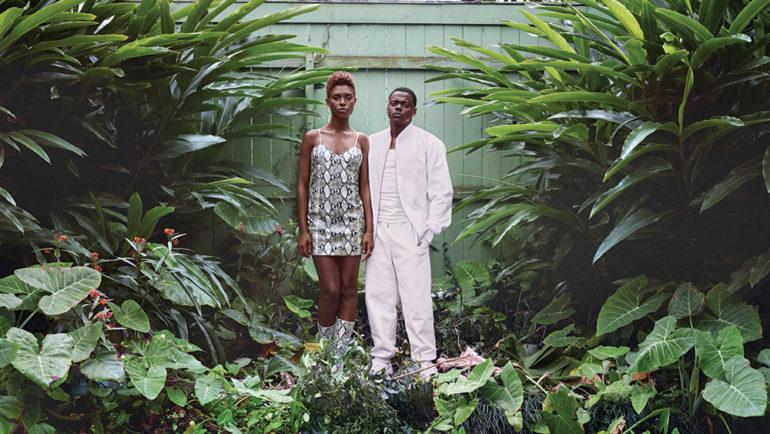
Production designer Karen Murphy also had to perform a lot of practical substitutions on “Queen & Slim.” Though the film encompasses a road trip from Ohio down to Florida, most of it was shot in Louisiana. “They’re going on a treacherous emotional journey and I was there to support that reality being reinforced every time they went to a new place or they went to someone’s house or they picked up a new car or whatever,” Murphy told Variety earlier this year. “There had to be a meaning in all of that and had to be real, had to be given a very solid grounding. Otherwise, how do you believe it?”
Murphy created a road map to understand where each of the character’s stops were along their route, even if it wasn’t specified within the script. It ground her, as well as the production crew in other departments, with an understanding of place.
Murphy remembered, “It became like this bible and became very natural for [director Melina Matsoukas] and I to just sort of say to each other, ‘No, this isn’t right. This doesn’t feel like Kentucky. It doesn’t feel like Florida. It’s not enough like Florida. It’s not green enough. The trees are olive green rather than bright green.’”
Friedberg talks about the influx of technology as an influence on design. “Designing with the idea of digital extension is something that’s a very big part of what I do,” he says. “It actually means I’m a lot freer out there in the world.” Friedberg designed the sets as he fully envisioned them for “” — some were physically built and other elements, including the rows of buildings in the background, were added later in effects.
Visual effects, too, helped blur the line of reality on “Ford v Ferrari” with assistance from Audouy’s art department. They generated more than 70 construction drawings for the Le Mans grandstands. “We modeled the entire virtual Le Mans site, including accurate topography and hundreds of period-accurate signs, which proved invaluable to the visual effects team in post and helped blur the line between practical and synthetic,” he says. Audiences might not notice any of the production designers’ work, in the same way that they don’t notice any of the other crafts, because if the teams are doing their work well, their work becomes invisible.

