Amazon’s Twitch Puts on Fresh Coat of Paint, Launches First Brand-Marketing Campaign
By Todd Spangler
LOS ANGELES (Variety.com) – Twitch has tweaked its logo and added a brighter purple to the site’s color palette in a redesign — which is part of a broader brand-marketing effort by the Amazon-owned streaming service to tell people that is for more than just live-streamed gameplay.
The updates are relatively subtle, but they mark first refresh for the Twitch brand eight years after it launched, born out of early live-streaming platform Justin.tv. It was acquired by Amazon for $970 million in 2014.
“[W]e know there are a lot of people out in the world who don’t know about Twitch — or may know about Twitch but don’t think it’s for them… yet,” the company says in a blog post .
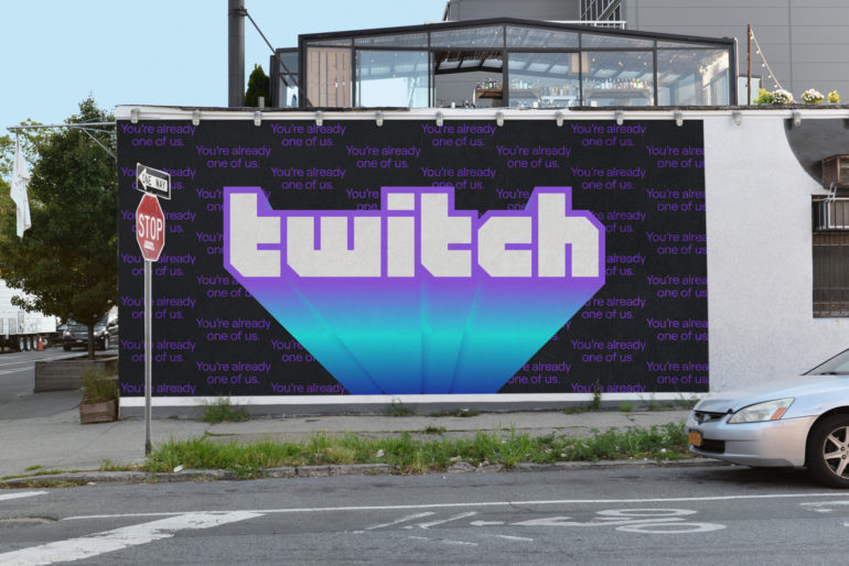
Twitch kicked off the new look ahead of TwitchCon 2019, being held Sept. 27-29 at the San Diego Convention Center. The new marketing campaign carries the tagline “You’re already one of us,” and encompasses online ads featuring a series of teaser videos from comedian-actor Eric Andre as well as billboards scattered across the U.S.
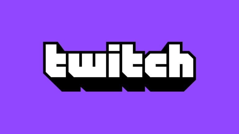
The updated logo, Twitch says, is “bigger and friendlier (and less text heavy)” than the old one, which you can see at this link . The new logo features a block letterform, inspired by the retro-game aesthetic, and the site’s new font, Roobert, is inspired by the retro Moog synthesizer. With the redesign, Twitch’s video player is now edge-to-edge across the screen, a change the company says provides a cleaner look and is easier to use.
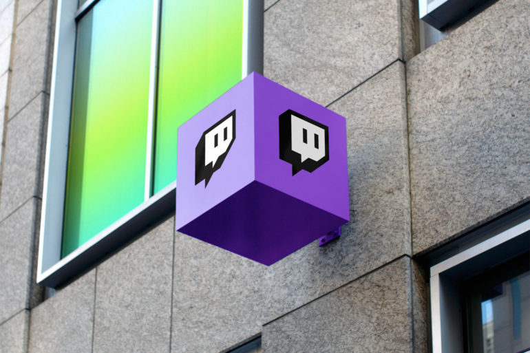
In addition to the more “vibrant” purple, Twitch is introducing two dozen new colors named after iconic games and pop culture (e.g., Black Ops, Ice, DK, Pika Pika). The site also is giving creators a new tool called Creator Color that lets them set a specific color to express themselves on their channels.
Twitch’s emotes, however, are remaining entirely unchanged. “Our community gave these beloved characters meaning, and touching them up or trying to align them all under one illustration style really didn’t feel like the right move,” according to the company.
The company also “evolved” the look of its Glitch icon. “Any brand should worry about retaining some recognizability when updating, but, like, this is Glitch,” Twitch says. “It’s tattooed on people. We couldn’t change it too much.”